
Have you ever wondered why the Hulk wore only purple pants? There are varieties of colours but why would they choose purple? This article written by me will definitely help you find the answer.
COLOUR HARMONY:
Colour harmony is the theory of combining colours in a fashion that is harmonious to eyes. It is this reason, “the Hulk wears only purple pants”. It is also the reason why, “the original X-Men had yellow and blue uniforms”. It is the reason behind almost all colour design decisions.
COLOUR WHEEL:
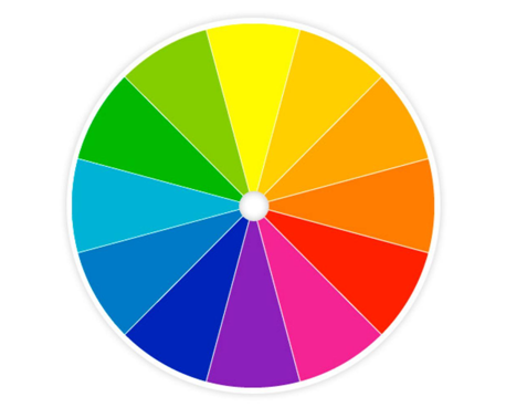
Colour harmony is based on the concept of a colour wheel. Essentially, it is a wheel with all the colours formed in a circle. Primary colours are on three equally distanced points of the wheel. Typically these are Red, Blue and Yellow. Since these three primary colours were used to mix almost all other colours, they are placed opposite to each other. In modern printing these are replaced with Magenta, Cyan and Yellow.
Between the three primary colours on the wheel are their mixed colours— for instance; purple between red and blue, orange between red and yellow, green between yellow and blue.
Closer to the middle of the circle, colours are less pure. At the outer edge of the circle, they are more pure and more saturated. Orange can range from a dark brown, to a bright orange to a pale skin tone. All of these are ORANGE when it comes to the colour wheel.
KEY COLOUR :
After the colour wheel, the next important thing to understand is the key colour. The key colour is the most important colour of your design. It is the colour that you fix and cannot be changed again. With respect to this key colour, you have to choose the corresponding colour that will suit the selected key colour in both shades and contrast. For example, If you are doing a photograph of a person, then their skin tone is your key colour.
When determining your colour harmony for the characters, you need to first determine your key colour and then with respect to that colour, choose the appropriate colour based on different types of harmonies from the colour wheel
TYPES OF HARMONY :
There are 5 types of colour harmony:
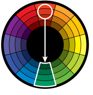
- DIRECT HARMONY: This is the most basic harmony and very simple too. This is nothing but, selecting a key colour from the colour wheel and the colour that is straight opposite is the complementary colour for the selected key colour. This is also called as “Complementary Harmony”. This type of harmony creates a vibrant look especially when used at full saturation. But when it is not used properly, it might be jarring.
- SPLIT COMPLEMENTARY: This harmony is similar to that of the direct harmony, but only with the difference that the split complementary takes the two colours directly on either side of the key colour. This essentially permits adorable range of colours giving more pleasant look for the characters.


- TRIADIC HARMONY: In this type of harmony, the complementary colours are fixed just two spaces away from the colour that is opposite to key colour. In other words, the colour that is adjacent to the split complementary colour is used in this harmony.


The triadic harmony may look beckoning when used appropriately and carefully. If not, the image would look glossy which could apparently be awful to the people who visualise the image.
- ANALOGOUS HARMONY: The complementary colours are chosen that is on the left and right side of the key colour. They are also called as Related Colours since these colours are directly related with the key colour. This colour can absolutely be a savoury to the eye. It can also come across as monotone


- TETRADIC HARMONY: The name itself depicts four colours. But how? These colours are chosen like a diamond, that is equally displaced from one another. This type of harmony is especially used in a place where it involves numerous elements or characters. By using colours equally distant on the colour wheel, each character gets equal attention and it would be eye- catching too.


This is quite interesting right!! Hope now you can also create your own characters with complementary colours.

Interesting
LikeLike
Ohh..nice..
LikeLike
Oh…Excellent
LikeLike
Oh…Excellent…..
LikeLike
Interesting article. Keep it going Ms.swetha
LikeLike
Suprrrr Swetha… Keep going… ☺️☺️☺️☺️
LikeLiked by 1 person
It’s nice and interesting.. quite a good information
LikeLiked by 1 person
Interesting article..
LikeLike
The information is quite interesting.
LikeLike
Yeah!!!!Gud try Swetha….. Congratulations on getting ur 1st article published!…..Let d success of ur 1st article will keep u going well beyond d 2nd,3rd nd so on☺…..I look frwd 4 ur next article!….
LikeLike
Sure abi… I will make my nxt article reach u soon
LikeLike
Super pa ….keep going ya
LikeLike
Nice topic …keep going …I am eagerly waiting for your next article…
LikeLike
Very nice one Sweatha….cool article…really nice…!!
LikeLike
Amazing article swetha. This is really great and it’s really cool. I know u could do more.. Wish u all the very best for u r success to continue…..
LikeLike